In the digital era, organisations across all sectors are expected to excel in customer service. Traditionally, customers need to contact the call center during business hours to resolve support issues. Often, there are long wait times or customers have to wait for the center to open, leading to severe dissatisfaction. This situation highlighted the need for an AI-powered chatbot that can assist customers 24/7 without requiring a human agent.
I worked with Jitendra, who was the Contact Centre consultant and helped me to understand how users interact with the agents at the contact centre. Imran, Tony and Ravi were the technology experts who also were well versed with the Generative AI technology. Parag was the Program Manager who orchestrated the project plan and resources. I worked with team to design the chatbot solution to address business and user needs.
As the primary UX/UI designer, I was responsible for:
As the digital technology has become more pervasive, there is a need to reduce the time required to resolve customer issues.
At this stage, our organization is yet to fully define our go-to-market strategy for the AI-powered chatbot, including deeper market research. We aim to launch and learn from this initial deployment to validate the hypothesis that there is a significant market need for this product. The cost of failure is low, and we have the capacity to build and iterate quickly, so we decided to:
I conducted an extensive research to understand the users' feelings, behaviours, aspirations and pain points. After some stakeholder interviews, I identified the biggest questions and objectives for initial research.
Based on our extensive research, we identified the below cohorts who could benefit from a chatbot.
I interviewed 5 Business stakeholders from few organisations out of the identified cohorts and 5 users of varied demography. I also conducted online surveys to understand the users I am designing for and their needs. I used the outcome of these interviews and surveys to generate insights and prioritise the requirements to guide project direction and decision-making.
After spending a day or two going through the raw interview data and survey results, several insights emerged.
Several insights emerged after reviewing the reports of the interviews conducted for some sample Businesses from the identified cohorts. These insights bolstered the need of having a chatbot.
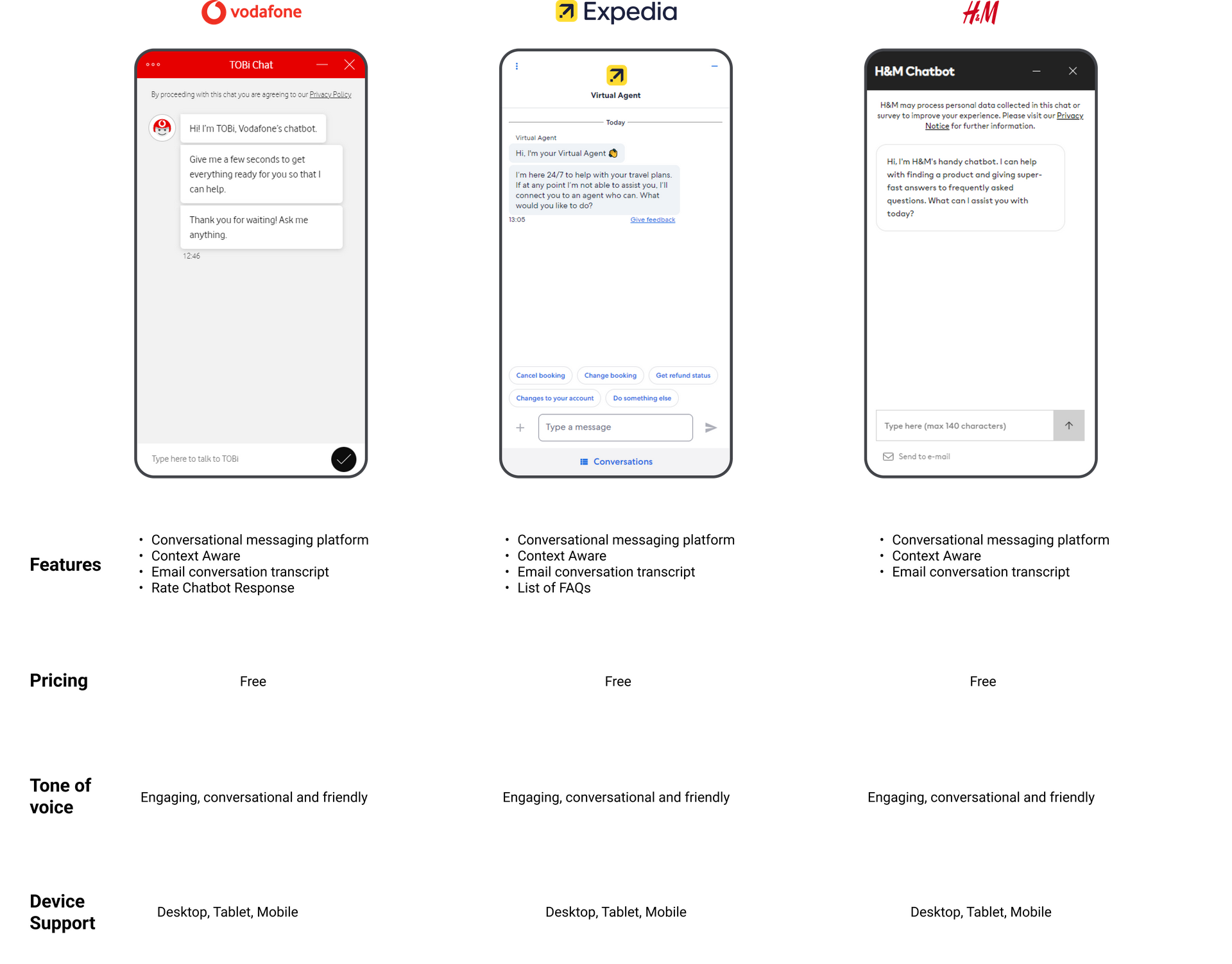
To get a holistic view of the market, we analysed several chatbots across various industry sectors. Popular apps like Vodafone, Expedia, H&M are well-designed with but lack accessibility features such as text to speech, and speech to text which would be extremely useful for users with disabilities. Our thorough research emphasised the opportunity for a platform like Nova to exist and helped to prioritise its features.

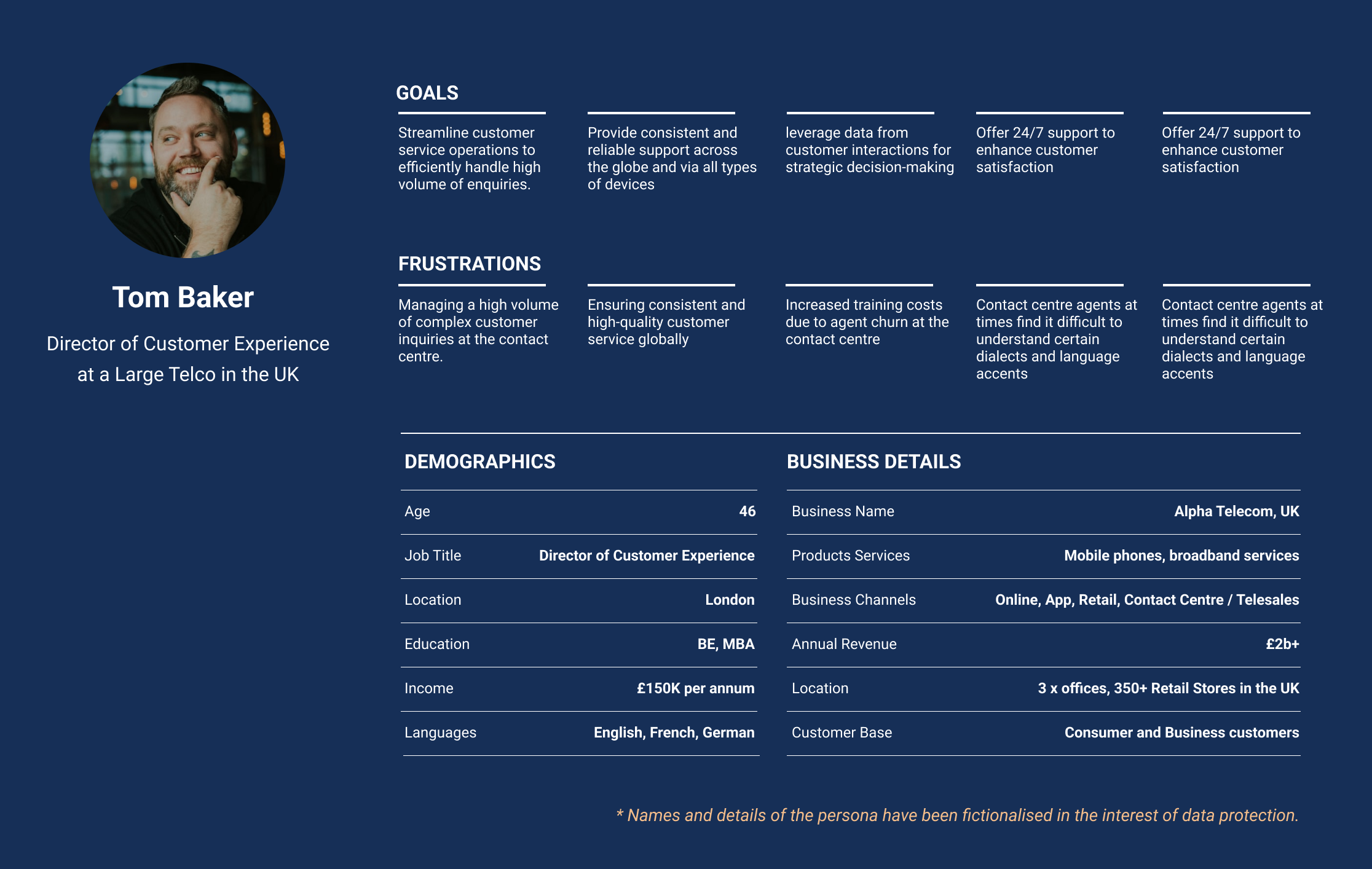
As a part of the project, personas were identified through interviews with representatives from various organization sizes, including small businesses, medium-sized businesses, and large enterprises. By analyzing the unique challenges, goals, and needs expressed during these interviews, three distinct personas were identified. Each persona highlights the specific requirements and expectations for chatbot implementation within their respective contexts.
Large enterprises such as financial institutions, large e-commerce platforms, telecommunications companies etc. deal with a diverse range of customers and complex business operations. Chatbots can serve as a centralized platform for managing customer inquiries across multiple channels, including websites, mobile apps, and social media. Our chatbot could deliver value quickly by improving response times, enhancing customer experience, as well as generating key insights for business decisions.
As a result, we decided this as our primary persona as it would help validate and test this solution for a wider spectrum of users.

Once we had identified Large Businesses as our target persona, I conducted a workshop for the team to collaboratively map out the user journey. As the team deliberated each step in detail, some gaps emerged as mentioned below.
I wanted to make sure my chatbot meets users' needs, so I used an affinity diagram. This phase helped me to organize ideas, understand what users want, and make a better chatbot that suits everyone.
Here's a quick look at how I did it:
In order to design the best user experience, I have looked at various possible paths the user might take during their journey and examine what happens during each step.
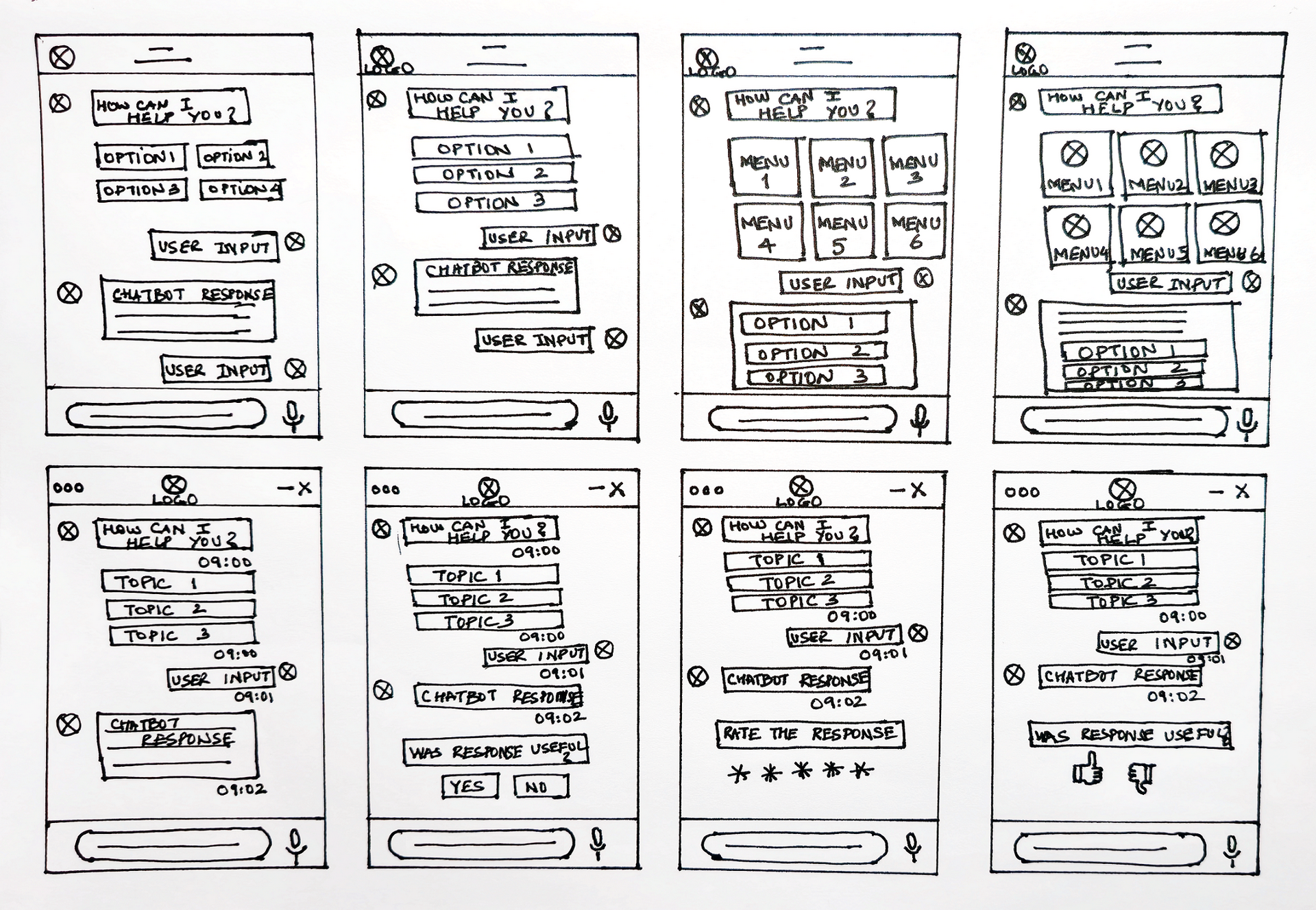
In the field of design, where time is both precious and a catalyst for creativity, the 8-minute rule emerges as a guiding principle for unleashing the power of hand sketching. I kicked off sketching the key screens of my chatbot guided by the 8-minute rule. This approach helped me to shape the rapid ideation and conceptualization of my chatbot's conversational interface.

As I started this phase of the Design Thinking process, it was essential to create the medium-fidelity wireframes as they serve as a bridge between the low-fidelity and high fidelity wireframes. They helped to provide enough detail to convey design intent while maintaining a level of abstraction that allows for iterative changes.
Building a style guide was essential to achieve consistency, efficiency, and a unified user experience across various devices. Our aim was to establish a style that not only reflected the brand identity but also streamlined the design and development processes.
This involved defining reusable elements such as buttons, forms, typography, and color schemes. Each component was meticulously crafted to ensure consistency and scalability across our digital ecosystem.
The creation of a design system was not a one-time endeavor but an ongoing commitment to improvement. Prototyping played a crucial role in validating our design system. We created interactive prototypes, allowing us to simulate user journeys and identify potential friction points. User testing became an iterative process, enabling us to refine our design components based on real user feedback.
Selecting the right font is a key decision in crafting a design system that not only captivates users but also aligns seamlessly with the brand identity. After careful consideration, I chose the Roboto font as the primary font of our design language. One of the main reasons for adopting Roboto is its unparalleled versatility.
Designed specifically for digital interfaces, Roboto harmoniously adapts to various screen sizes and resolutions. Legibility is paramount in delivering a positive user experience, especially in the context of a chatbot where communication is key. Roboto's balanced letterforms and open, modern design contribute to excellent readability, enhancing users' ability to engage with the chatbot effortlessly and understand information at a glance.
Selecting a color for a design system is not just an aesthetic decision; it's a strategic choice that influences user perceptions and interactions. Blue is universally associated with trust, reliability, and professionalism.
In the context of my chatbot, which serves as a digital companion for users seeking information and assistance, instilling a sense of trust is paramount.
The calming and stable nature of blue contributes to a positive user experience, fostering a reliable connection with the platform. Blue, with its high contrast against white backgrounds, enhances text readability and ensures that essential information is easily legible, especially for users with accessibility constraints.
My approach to create high-fidelity wireframes in Figma was not just about pixels and layouts; it was a structured process of transforming ideas into visually rich designs. Using Figma's robust features, along with a systematic approach to wireframing, allowed me to translate abstract ideas into refined designs that aligned with the project's objectives
With the design system in place, I used the typographic choices and color palettes. I integrated the chosen fonts and color schemes, aligning them with the project's brand guidelines. Recognizing the importance of responsive design, I adapted the high-fidelity wireframes to various screen sizes. Figma's responsive design features and constraints allowed me to create wireframes that maintained visual integrity across devices, ensuring a consistent user experience.
These screens welcome the user with a quick introduction, guiding them on how to interact and showcasing key features. They enhance the user's understanding, and foster confidence in the user.
Screens for users to create a new account. Simplified steps ensure a seamless process, collecting essential but minimal information and enabling users to quickly access the chatbot.
Login screens for allowing access to the chatbot. Users can securely log in, providing a personalized experience. Simplified authentication ensures a quick entry into the chatbot.
User-friendly interface facilitates easy interaction, providing an engaging conversational chat experience with the chatbot.
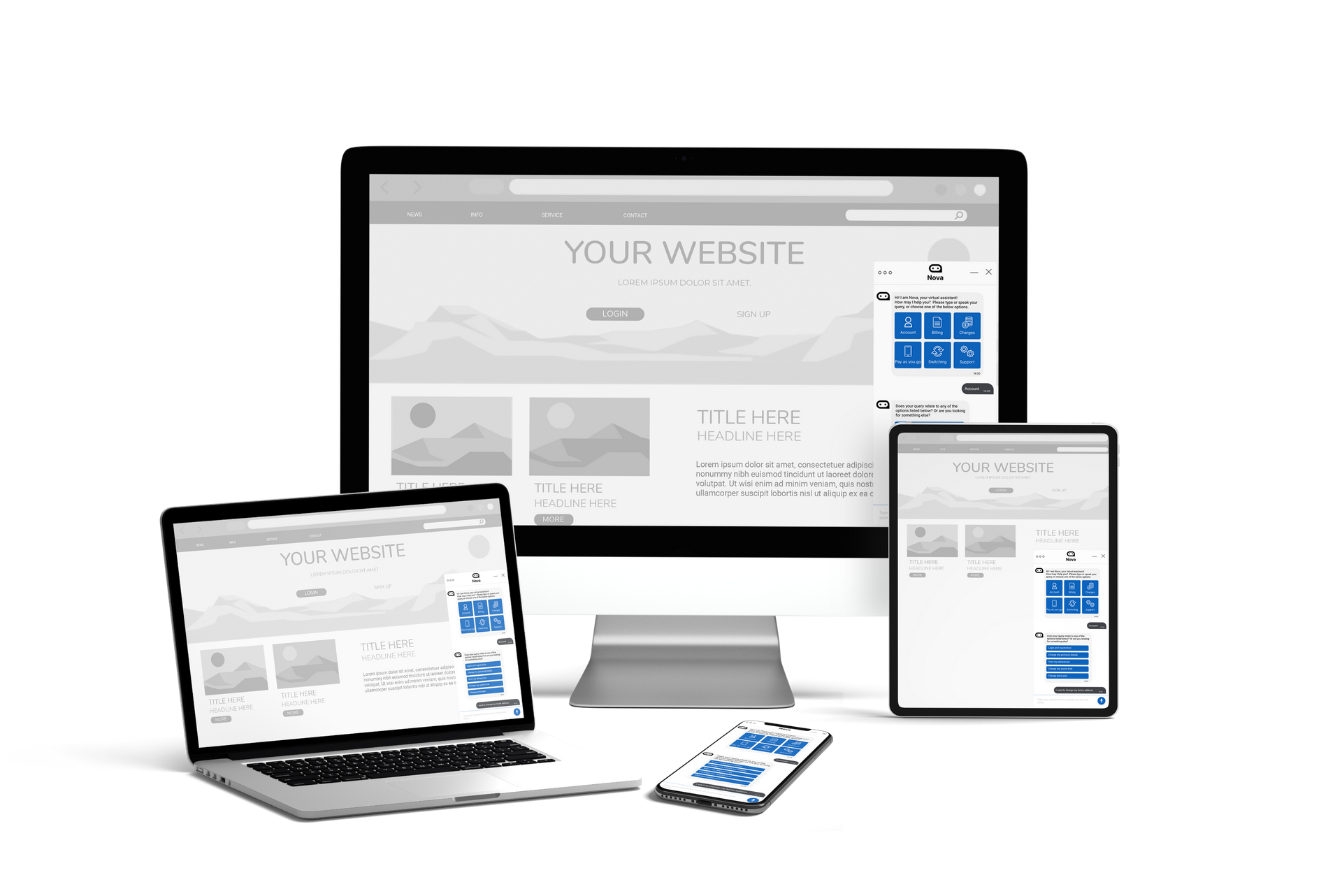
While designing the chatbot, I gave special attention to responsiveness, ensuring it works seamlessly across various devices, such as smartphones, tablets, and computers. This approach guarantees a consistent and user-friendly experience for individuals regardless of the device they use.

In the dynamic landscape of digital interactions, my chatbot has emerged as guiding light for users through huge amount of conversations and transactions. Beyond its role as a virtual assistant, the chatbot has become a source of insights, providing a detailed understanding of user behaviors, preferences, and the evolving landscape of user needs.
I requested 25 users to test the prototype and share their feedback. I received interesting responses from users of various different personas. Large amount of users found that it was very easy to use the chatbot and it took one tenth of the time to get the issue resolved as opposed to spending 20+ minutes to discuss the issue with a human agent at the call centre.
After spending a day or two going through the raw interview data and survey results, several insights emerged.