Goals · Discovery · Design Workshops · Wireframes · Final Design · Test · Conclusion
In 2020, a large telecommunications company in the UK was going through an omnichannel digital transformation program aimed at seamlessly integrating its various customer touchpoints, including online platforms, mobile apps, and physical stores, to deliver a cohesive and personalized experience across all channels. The goal of the the multi-year program was to to formulate a digital strategy aimed at transforming the Telco into a beloved brand while enhancing customer satisfaction, streamlining operations, and driving business growth in the competitive telecom market.
The overall program comprised of over 400 diverse use cases of varied complexity, functionality and user interactions. One such use case involves the scenario where a user opts for auto top-up but desires the flexibility to customize the top-up amount based on individual preferences and usage patterns. This use case emphasizes the program's commitment to meeting varied needs and preferences of users, ensuring a personalized and seamless experience. In this case study, I've specifically highlighted this use case, which is the auto top-up feature.
I was one of the UX Designers on the program which comprised of a large cross-functional team from various departments including product management, developers, business analysts etc. provided diverse perspectives and expertise. The collaborative approach facilitated comprehensive problem-solving, allowing us to address a wide range of considerations such as user needs, business objectives and technical feasibility.
As a UX designer on the program, I was responsible for shaping the user experience landscape for several use cases such as auto top-up, payment journeys, debt collections, agent facing use cases etc., ensuring a smooth and intuitive journey for users across different channels.
As a part of the program, we recognized a significant pain point in our service offering: the absence of an auto top-up feature. This void not only hindered user convenience but also posed challenges in retaining customers. In response to this pressing need, I and my team embarked on a journey to address this pain point and enhance our service offering in a human-centered manner.
The solution includes introduction of a new feature that automatically tops up a user's account when their credit runs low or at a set time interval chosen by the user. This feature will be easy to use, allowing users to customize when and how much their account gets topped up. The aim is to create simple journey to help users use this feature in just a few clicks, and send the users handy notifications to let them know when their account is topped up.
We followed a systematic and collaborative approach to problem-solving and design thinking. We began by understanding the problem through research and user feedback. We then engaged in brainstorming and ideation sessions to generate solutions. These ideas were prototyped and tested iteratively based on user feedback and usability. Throughout the process, we focused on user-centric mindset and ensured that our solutions addressed real user needs and provided a better experience.
A comprehensive research was done to understand the users' feelings, behaviours, aspirations and pain points. During this phase, interviews were conducted with our contact center and retail store staff to understand the key customer complaints and areas of improvement. Research involved conducting surveys and analysing complaints on social media platforms.
Quantitative analysis involved examining numerical data to gain insights into user behaviors and preferences. Research involved conducting surveys and analysing complaints on social media platforms to quantify the extent of the problem. This analysis provided valuable quantitative insights.
Surveys and interviews were conducted with our contact center and retail store staff and complaint metrics were analysed to understand what the customers needed the most. It is important to understand the user feelings and pain points in order to create truly empathetic and user-centric experiences. Designing with these emotions in mind allowed me to build positive user experiences, building the auto top-up feature that not only delivers functionality but also resonates with the feelings of the users.
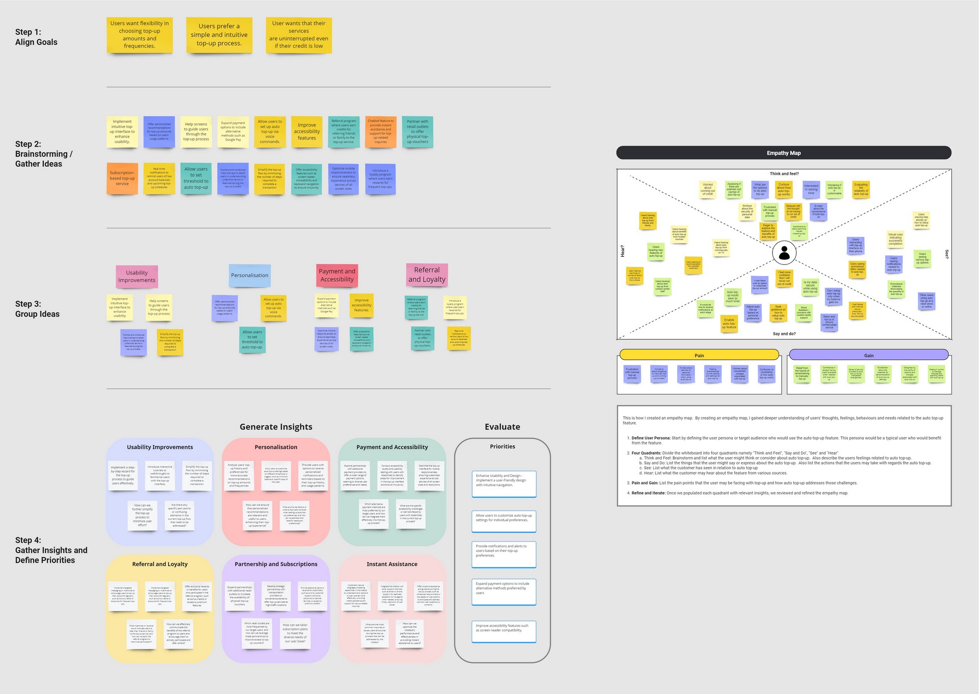
Based on the insights from the UX research, we started with discovery workshops to learn more about our users. This is a specific activity of the discovery phase where key stakeholders (UX/UI designers, UX researchers, POs, BAs, architects, tech leads, legal and compliance, Business representatives) get together for the specific purpose of ideating and defining the project objectives, requirements, and expected outcomes.
Implemented the auto top-up feature, allowing users to automate the process of topping up their account balance. This feature eliminates the need for manual intervention, ensuring seamless and timely replenishment of their account credit.
With the auto-topup feature, users no longer need to worry about service disruptions caused by insufficient credit. By setting up automatic replenishment, users can ensure continuous access to telecom services without the risk of interruptions.
The auto-topup feature offers users greater control and flexibility by allowing them to customize their top-up settings based on their usage patterns and preferences. Users can choose the desired top-up amount, frequency, and payment method, empowering them to tailor the service to their individual needs.
We began by collecting a diverse range of data sources, including user feedback, usability testing results along with cross-functional teams. Next, we organized the collected data onto individual sticky notes, capturing key insights, pain points, and ideas related to the top-up process. Using a collaborative approach, I facilitated a workshop where team members grouped the sticky notes into themes based on commonalities and relationships. Through iterative discussions and refinement, we identified distinct categories such as usability enhancements, personalization opportunities, engagement strategies, payment options, and customer support improvements. Finally, we analyzed the affinity diagram to extract actionable insights and prioritize next steps, ensuring that our decisions were informed by user needs and aligned with business objectives.
Here's a quick look at how we did it:
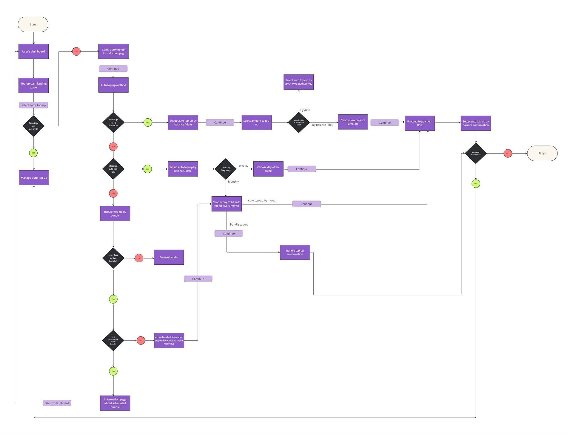
Next step was to define and agree the user flows with the key stakeholders including the POs and technical teams so that the backend development can start without the need of final UX designs. We defined the path taken by a user to complete the top-up journey from point A to point B.
In order to design the best user experience, I looked at various possible paths the user might take during their journey and examine what happens during each step. I started by identifying the key stages and touch points in the user's experience from initial discovery to ongoing usage. I mapped out user's actions, thoughts, and emotions at each stage of the journey. While collaborating with cross functional teams, I visualised the user journey using diagrams and flowcharts. The user journey flow takes the users from their entry point through a set of steps towards a successful completion of top-up.
In crafting the user experience for our top-up feature, three key design decisions were made to enhance usability and convenience:
Each screen in the top-up journey was carefully designed to perform a specific step, ensuring clarity and ease of navigation for users. For instance, the first screen prompts users to enter the top-up method, while the following screen allows users to select the top-up amount.
Consistency in design elements, such as buttons and layout, was maintained across all screens to create a cohesive user interface. We leveraged our design system to keep everything looking the same throughout the top-up feature. This system had all the rules for things like buttons, colors, and text styles. So, no matter which screen you were on, everything looked consistent and familiar. This made it easier for users to understand and use the top-up feature without getting confused.
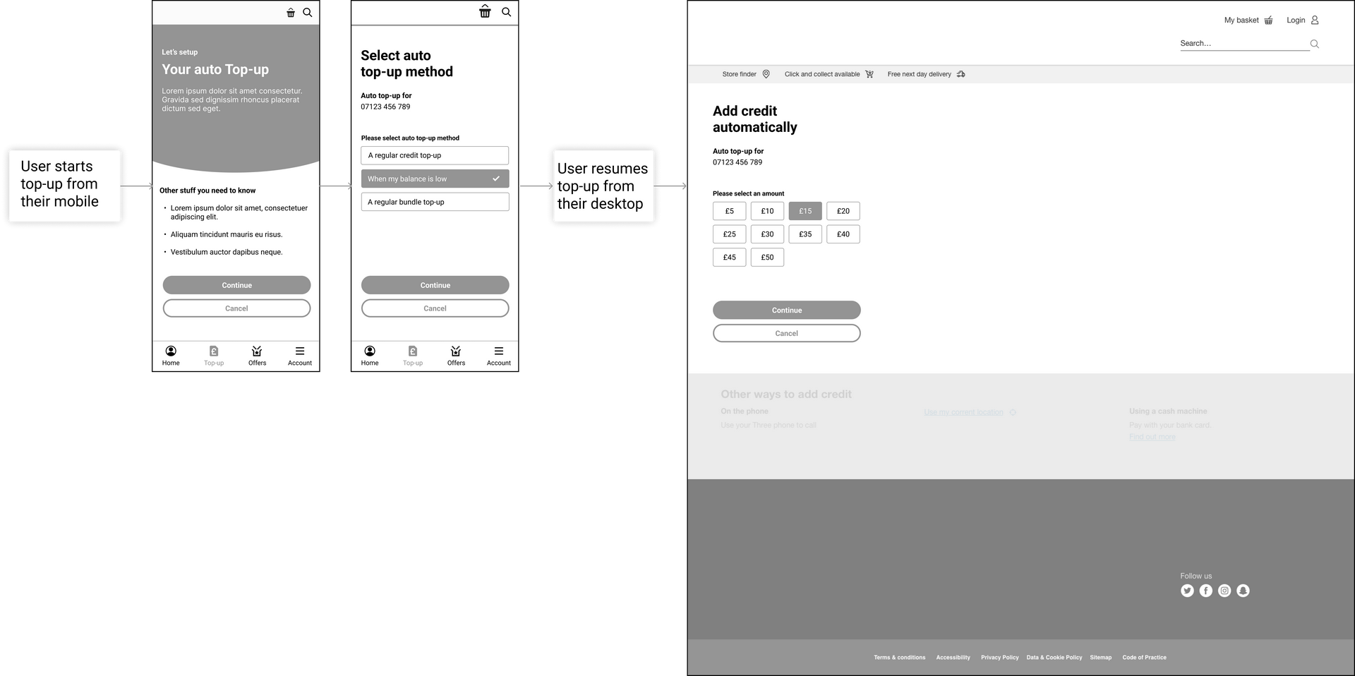
The design was optimized to deliver a true omnichannel experience, allowing users to seamlessly transition between devices. We wanted to make sure it was super easy for people to use, no matter what device they were on. So, let's say someone starts adding credit to their account on their phone while they're out and about. Later, when they're at home, they can easily finish up the process on their tablet or computer without any hassle. This way, people can switch between devices whenever they need to without losing their progress.To make this happen, we divided the top-up process into smaller steps, each shown on different screens. For example, one screen might ask for the amount of credit the person wants to add, while another screen might confirm the payment details. This way, no matter where someone starts the process or which device they use, they can easily see where they're at and what they need to do next. This approach enhanced user flexibility and convenience, ultimately leading to higher satisfaction and engagement with our top-up feature.
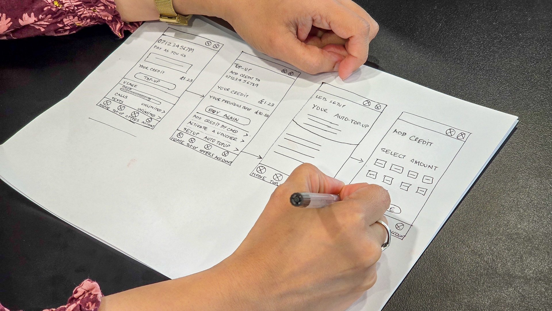
Sketching played a pivotal role in the development of the top-up journey by serving as a rapid ideation and iteration tool. Initially, sketching allowed me to explore various concepts and potential user flows quickly and effortlessly. By sketching out different ideas on paper, I was able to visualize and conceptualize the top-up journey in its early stages, fostering creativity and innovation.
As the design process progressed, sketching facilitated collaboration and communication within the team, enabling us to share ideas, gather feedback, and iterate on the design concepts iteratively. Moreover, sketching helped me refine the details of the top-up journey by focusing on key user interactions, interface elements, and flow transitions. By sketching out each step of the journey, I was able to identify potential pain points, usability issues, and opportunities for improvement early on, allowing for swift adjustments and refinements.
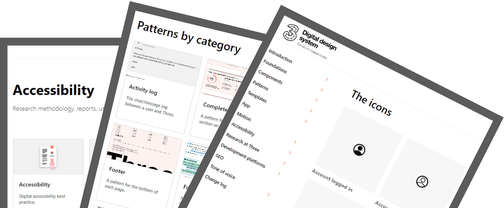
For the auto top-up feature, I leveraged Three's existing Design System, which provided a set of guidelines, components and patterns to ensure all our digital products looked and worked the same way. This allowed me to focus more on solving user problems rather than redesigning elements. This is how it helped:
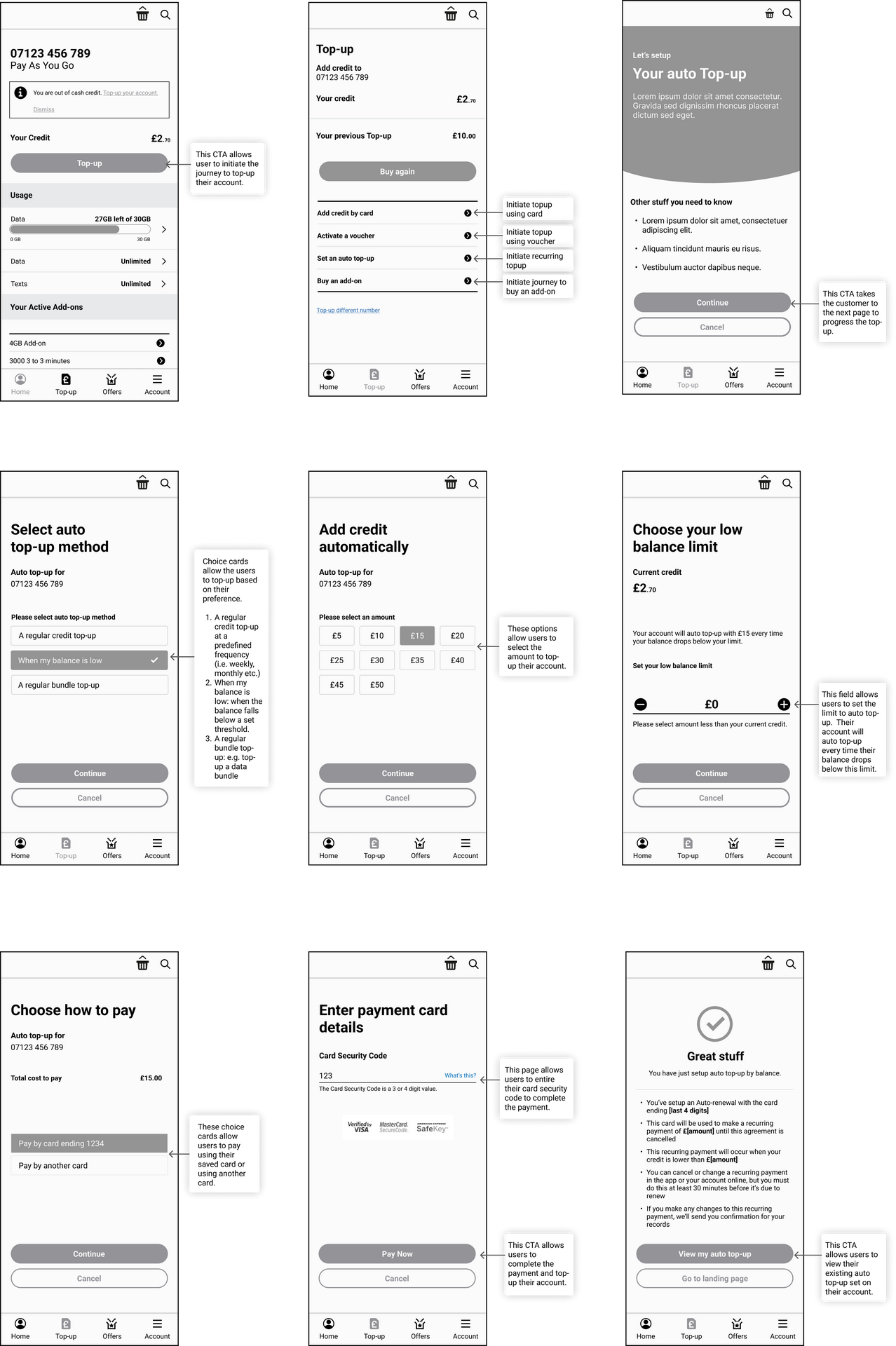
As I started this phase of the Design Thinking process, it was essential to crreate the medium-fidelity wireframes as they serve as a bridge between the low-fidelity and high fidelity wireframes. They helped to provide enough detail to convey design intent while maintaining a level of abstraction that allows for iterative changes.
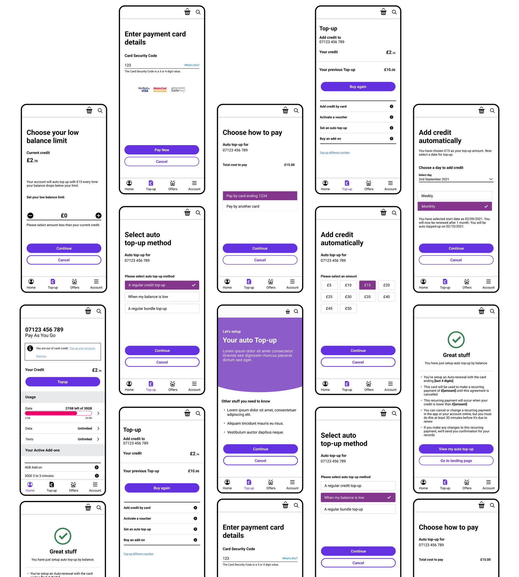
My approach to create high-fidelity wireframes in Figma was not just about pixels and layouts; it was a structured process of transforming ideas into visually rich designs. Using Figma's robust features, along with a systematic approach to wireframing, allowed me to translate abstract ideas into refined designs that aligned with the project's objectives
With the design system in place, I used the typographic choices and color palettes. I integrated the chosen fonts and color schemes, aligning them with the project's brand guidelines.Recognizing the importance of responsive design, I adapted the high-fidelity wireframes to various screen sizes. Figma's responsive design features and constraints allowed me to create wireframes that maintained visual integrity across devices, ensuring a consistent user experience.
This feature is designed to provide users with a seamless and hassle-free way to ensure their account balance is always sufficient for uninterrupted service. With this feature enabled, users no longer need to worry about manually initiating top-ups or experiencing service disruptions due to insufficient credit.

This feature is designed to provide users with a convenient and worry-free way to maintain their account balance without manual intervention. With this feature enabled, users can set up automatic top-ups at predefined intervals, ensuring their account always has sufficient credit for uninterrupted service.

In creating the wireframe flow for the auto top-up feature, I began by outlining the key user interactions and decision points involved in setting up and managing auto top-up. Using wireframes, I mapped out the sequence of screens or steps that users would encounter, focusing on clarity, simplicity and ease of use. Throughout the process, I iterated on the wireframe flow based on feedback from stakeholders and usability testing, refining the design to ensure a seamless and intuitive user experience. The wireframe flow served as a key artefact for the development of high-fidelity prototype and ultimately the implementation of the auto top-up feature.
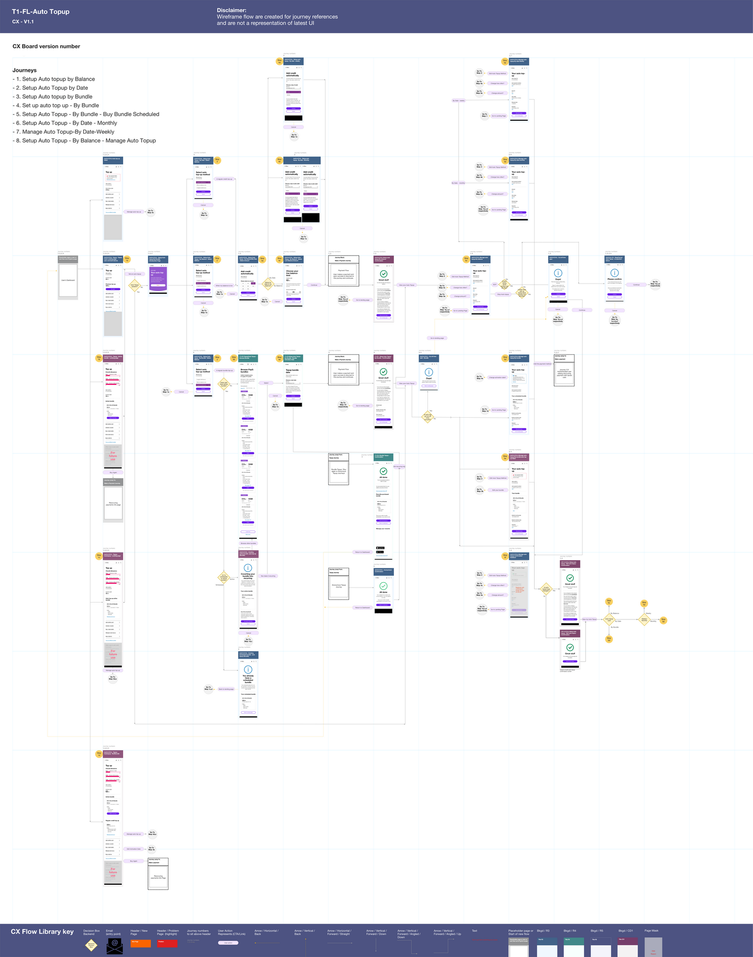
I created the prototype of the auto top-up feature in Sketch and Invision. This allowed users to see how it would work and feel before building the real thing. Users could interact with it, provide valuable insights for refining and improving the final design.
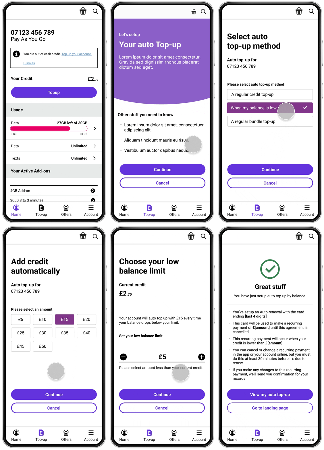
During the Test phase, prototypes of the auto top-up feature were presented to representative users, who interacted with the prototypes and provided feedback based on their experiences. Usability testing involved observing users as they performed tasks related to setting up auto top-up, initiating top-up transactions, and adjusting settings. Through this process, insights were generated regarding usability, functionality, and user satisfaction.
Insights gathered from usability testing informed iterative improvements to the auto top-up feature, ensuring that it met user needs and expectations effectively. By incorporating user feedback and addressing pain points identified during testing, the final design of the auto top-up feature was optimized for usability, functionality, and user satisfaction.
As a final step, we held design handover workshops with all key stakeholders including UX Designers, POs, developers, technical leads and testers. During this workshop, we walked through all the designs with the technical teams to ensure that everyone was aligned.
In handing over the UX designs to developers, I ensured clear communication by providing detailed annotations and explanations for each element within the boards. I included details of interactions, and highlighted any specific functionality and requirements. Additionally, I collaborated closely with the developers, addressing any questions or clarifications promptly to ensure smooth transition from design to development. This approach led to efficient implementation of the auto top-up feature.
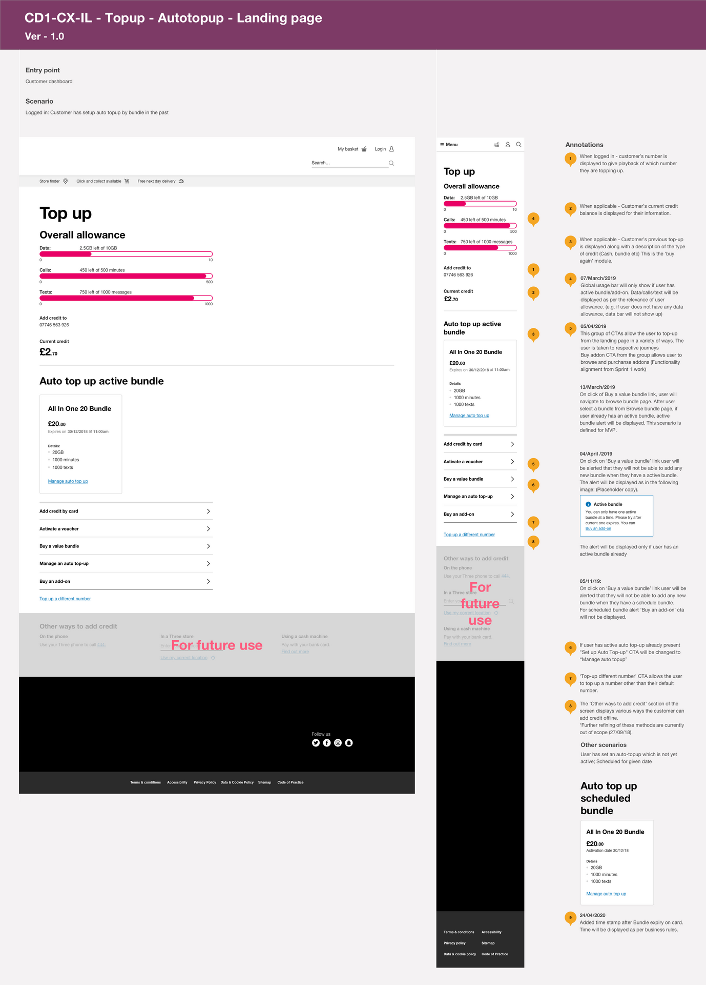
The introduction of the auto top-up feature at the Telco has marked a significant milestone in my efforts to enhance the user experience and address key pain points faced by our customers. Through meticulous research, iterative design, and usability testing, I have contributed to the implementation of a solution that not only streamlines the top-up process but also provides tangible benefits to the users.
The quantified metrics highlight the considerable improvements brought about by the auto top-up feature.
This program proved remarkable in my evolution as a UX designer. From initially conceptualizing user flows to refining interface designs, I applied user-centric principles to effectively to deliver solutions aligned with the overarching objectives of the transformation program. Through continuous learning and adaptation, I not only contributed to the success of the initiative but also honed my skills as a proficient UX designer, capable of navigating complex digital landscapes with finesse. Embracing agile methodologies, I was involved in engaging stakeholders, including third-party collaborators, in iterative sprints to ensure continuous improvement.