Goals · Research · Journey Flow · Interface · Style Guide · Testing · Outcomes
‘La Cuisine Royale’ is an eCommerce app for a restaurant in Paris. The app will allow users to order food for delivery, collection or serve at a table in the restaurant. The app will also allow users to book a table to dine-in at the restaurant, and thus save time wasted in queueing.
The goal of the app is to build an intuitive and enjoyable user experience to search from the menu items and successfully place the order with minimal clicks.
With the onset of digitisation, online orders for food takeaway and delivery have risen exponentially over the years. This has evolved as the easiest way for consumers to get their food served within the comfort of their homes.
People care about ensuring that families and children get their meals on time. In the modern world, people often need to spend excessive time at work. Cooking food after long working hours limits the time they can spend with their families, and also delays the time of meal at times. Also, people with hearing impairment find it challenging to order food over a phone call or in person at the restaurant.
This app is a small contribution towards simplifying this experience in people's life.
As the primary UX/UI designer, I was responsible for:
My approach in designing the restaurant app centered on user-centric principles. I conducted extensive user research, including interviews and surveys, to understand needs and pain points. Using insights gained, I developed wireframes and prototypes, iteratively refining them through usability testing. Key features like seamless ordering, table booking, and efficient navigation were prioritized. The design emphasized simplicity, clarity, and intuitive user experiences, guided by continuous feedback and competitor analysis.
I conducted an extensive research to understand the users' feelings, behaviours, aspirations and pain points. After some stakeholder interviews, I identified the biggest questions and objectives for initial research. This deepened my empathy, laying the foundation for a more informed and user-focused design process for the restaurant app.
I conducted an online survey. 90 users participated in the survey. This helped to derive objective insights into app usage patterns, preferences, and performance metrics.
After spending a day or two going through the survey results, several insights emerged.
Through user interviews, I explored feelings and pain points, pinpointing specific challenges users faced with the restaurant app.
The user journey in the La Cuisine Royale app begins with a welcoming home screen, offering options to order for delivery, collection, serve at a table, or book a table. Users can seamlessly navigate the menu, customizing orders as needed, and proceed to a clear checkout process. For delivery or collection, users receive order confirmations and can also track their orders. Serving at a table involves selecting a table, browsing the menu, and submitting orders for kitchen preparation. Booking a table is straightforward, allowing users to choose date, time, and receive reservation confirmations. Post-order interactions include tracking and notifications. The app also features an account section for order history, reordering, and account management, enhancing the overall user experience.
I meticulously created low-fidelity sketches and digital representations to outline the screens and user interactions. Prioritizing simplicity and clarity, I focused on designing an intuitive layout for menu navigation, ordering, and table booking processes. This involved mapping out each screen, emphasizing key elements like menu categories, item details, and checkout options. By creating these wireframes, I aimed to get a clear visual understanding of the user journey for both ordering food and booking tables.
This early-stage visualization helped for the subsequent design iterations. The wireframes played a pivotal role in ensuring that the final design would offer a seamless, user-friendly interaction for customers, ultimately contributing to the success of the restaurant app.
The onboarding process provides a seamless orientation, highlighting key features such as ordering for delivery, collection, serving at a table, and booking a table. The screens incorporate visually appealing graphics and brief instructions to swiftly familiarize users with the app's functionalities. By prioritizing simplicity and clarity in these onboarding screens, I aimed to ensure that users can effortlessly navigate the app, encouraging a positive and intuitive first-time experience.
In the create account screens of the restaurant app, I focused on streamlining the user registration process to be quick and user-friendly. The screens present a clean and intuitive layout, prompting users to input essential information such as name, email, and password. To enhance security and convenience, I incorporated secure password creation guidelines. To enhance security, a one-time password (OTP) is sent for validation.
The menu selection, ordering, and delivery screens are designed to offer users a seamless and enjoyable experience. The menu selection screens are organized intuitively, allowing users to easily browse through categories and find their desired items. When placing an order, the screens provide a user-friendly interface for customization, ensuring users can tailor their selections to their preferences. The streamlined checkout process includes clear order summaries and payment options. Post-order, the delivery screens offer real-time tracking and updates, keeping users informed about their order's status.
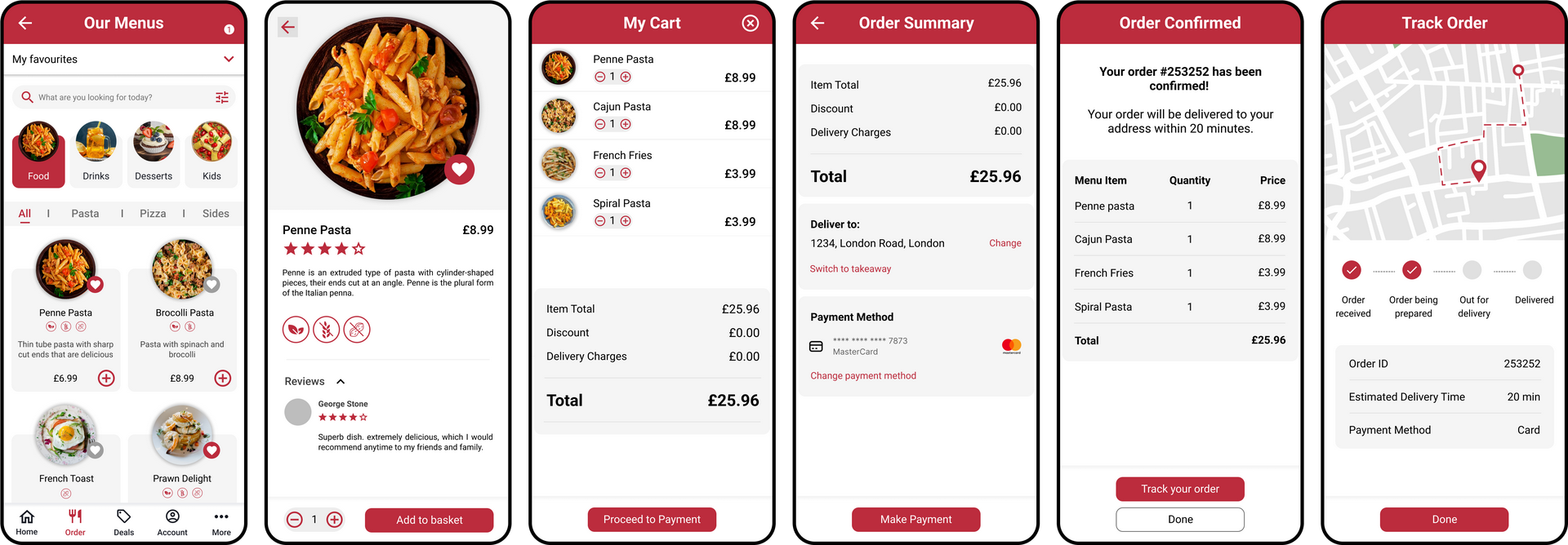
In the menu selection phase, users navigate through intuitively organized categories to find their desired items. The ordering screens feature a user-friendly interface for customization, allowing users to tailor their orders according to their preferences. For collection/takeaway, the screens streamline the process, providing clear instructions for pickup times and location.
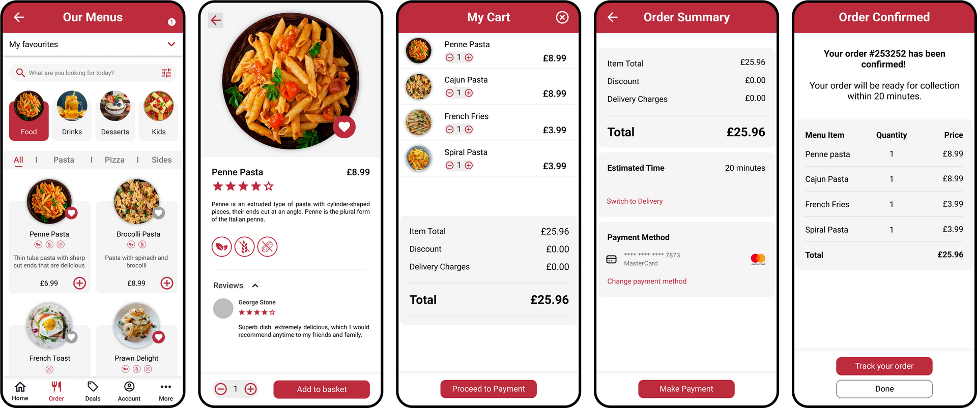
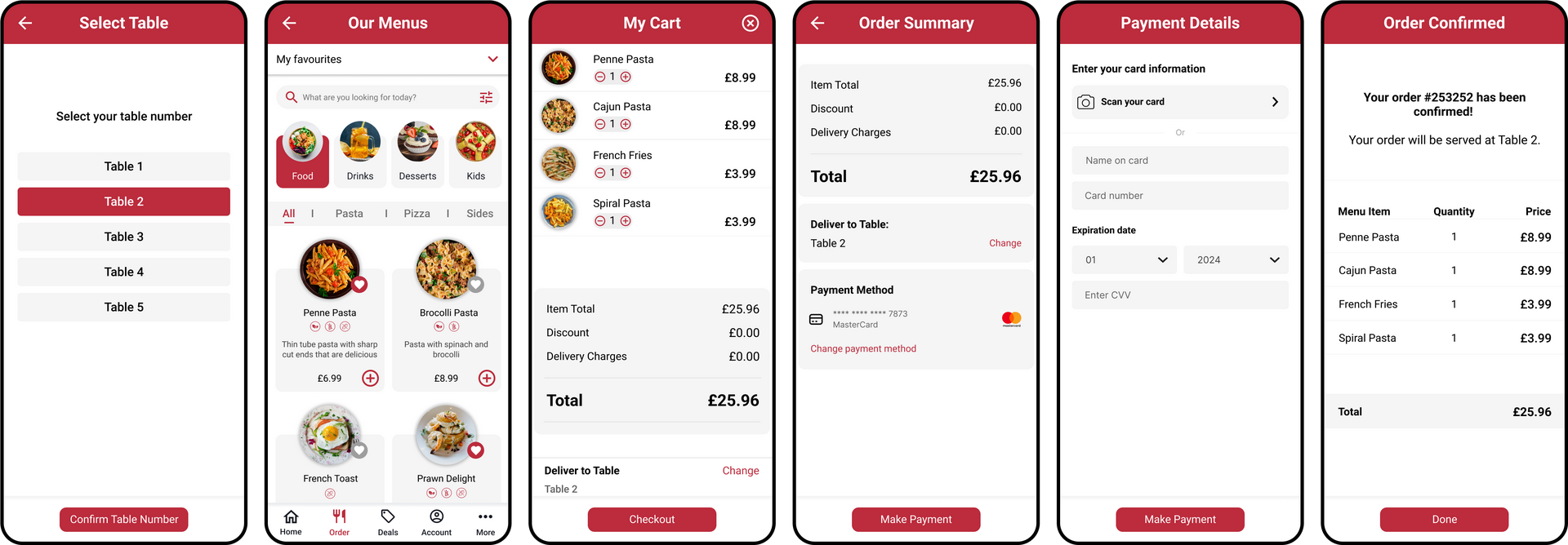
This journey is designed to enhance the in-restaurant experience for users. Users can seamlessly browse the digital menu, explore various categories, and view detailed item descriptions. Once they have made their selections, the screens guide them through the order placement process. Overall, these screens prioritize efficiency, allowing users to focus on their dining experience rather than the logistics of the order and payment process.
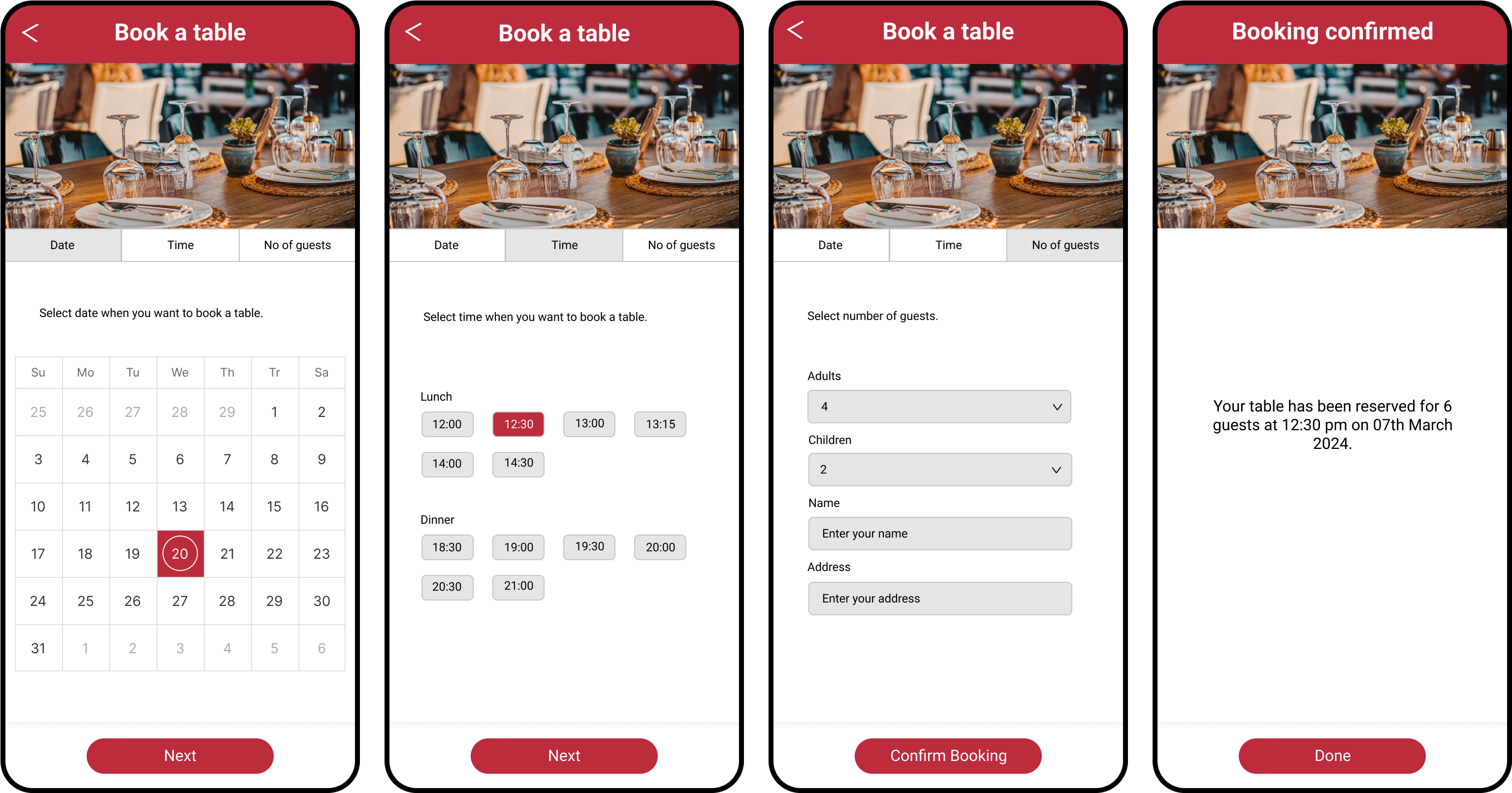
This journey is designed to simplify the reservation process and enhance the overall dining experience. Users can effortlessly select their preferred date and time, specify the number of guests, and view available tables. After confirming the reservation details, users receive a prompt confirmation about securing a table. This feature not only minimizes waiting times for users but also adds a layer of convenience and efficiency to the dining-in experience, contributing to a positive overall impression of the restaurant app.
Building a style guide was essential to achieve consistency, efficiency, and a unified user experience across various devices. My aim was to establish a style that not only reflected the brand identity but also streamlined the design and development processes.
This involved defining reusable elements such as buttons, forms, typography, and color schemes. Each component was meticulously crafted to ensure consistency and scalability across our digital ecosystem.
The creation of a design system was not a one-time endeavor but an ongoing commitment to improvement. Prototyping played a crucial role in validating our design system. We created interactive prototypes, allowing us to simulate user journeys and identify potential friction points. User testing became an iterative process, enabling us to refine our design components based on real user feedback.
Selecting the right font is a key decision in crafting a design system that not only captivates users but also aligns seamlessly with the brand identity. After careful consideration, I chose the Roboto font as the primary font of our design language. One of the main reasons for adopting Roboto is its unparalleled versatility.
Designed specifically for digital interfaces, Roboto harmoniously adapts to various screen sizes and resolutions. Legibility is paramount in delivering a positive user experience. Roboto's balanced letterforms and open, modern design contribute to excellent readability, enhancing users' ability to engage with the app effortlessly and understand information at a glance.
The chosen color scheme for the restaurant app is rooted in the psychological impact of colors in the context of food and dining. Red as the primary color, orange and yellow for call-to-action (CTA) buttons, black for text, and grey palette shades for backgrounds.
Red is a powerful color that stimulates appetite and conveys excitement and energy, making it ideal for a food-related app. Orange and yellow, used for CTAs, are warm, inviting colors that evoke feelings of happiness and hunger, encouraging users to take action.
Black text ensures readability and contrast against lighter backgrounds, while grey palette shades provide a neutral, clean backdrop that allows the vibrant colors to stand out without overwhelming the user. This color scheme not only enhances the aesthetic appeal of the app but also aligns with the psychological principles that can positively influence user behavior in a dining context.
Usability testing was conducted using an industry recognized tool - Maze. 65+ testers took the test, yielding a diverse range of feedback, both positive and negative. This played a pivotal role in identifying user's challenges while using the prototype.
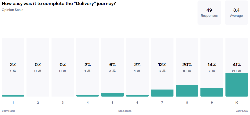
This section of the report shows the usability score for each of the screens and highlights the screens where there is a scope for improvement.

This section of the report shows the usability score for each of the screens and highlights the screens where there is a scope for improvement.
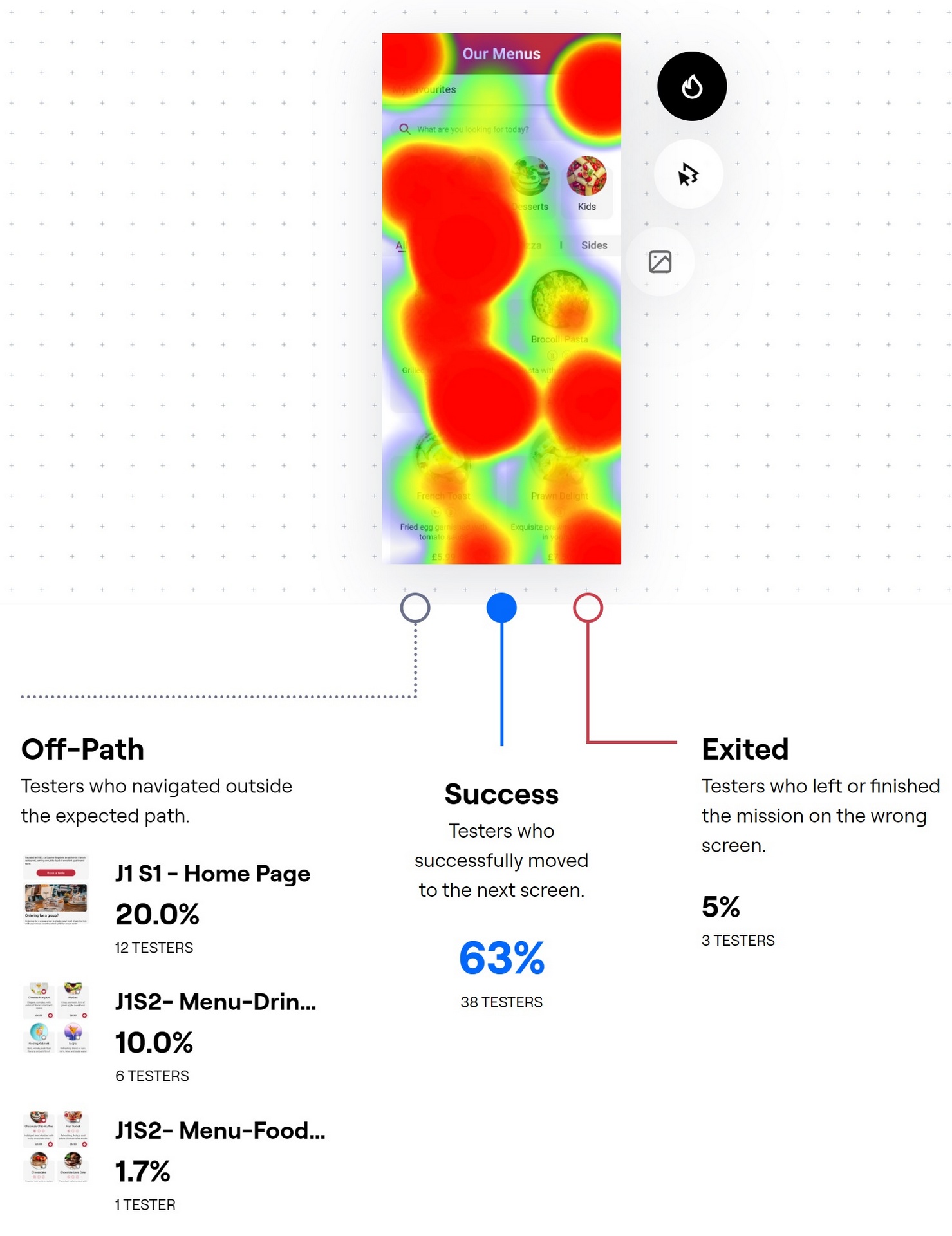
Testers' feedback highlighted a significant challenge: users struggled to navigate the checkout flow seamlessly after adding items to their basket. This critical insight propelled a series of design adjustments aimed at elevating user experience. Through iterative design, the checkout process was streamlined to be more intuitive and user-friendly.
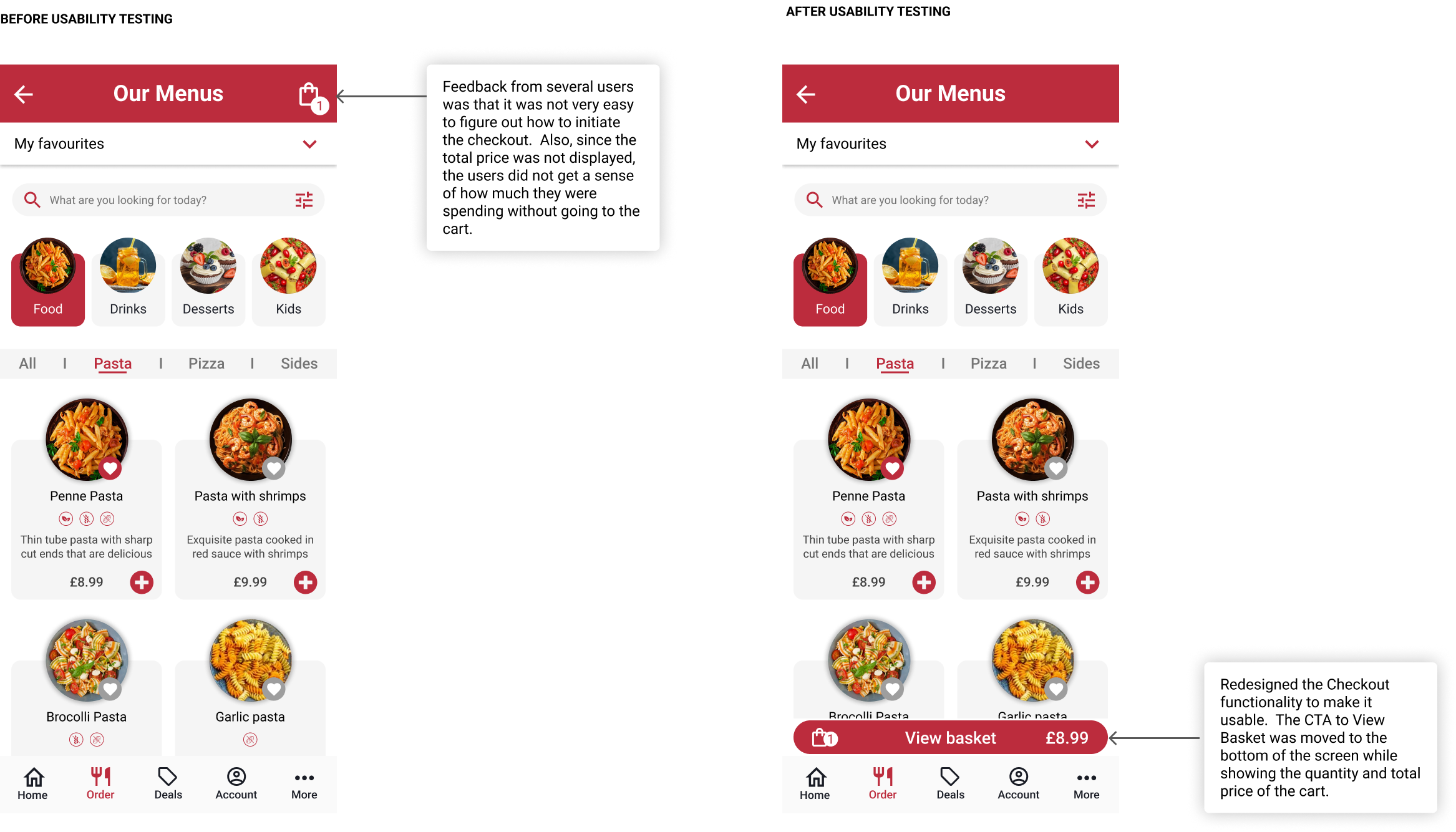
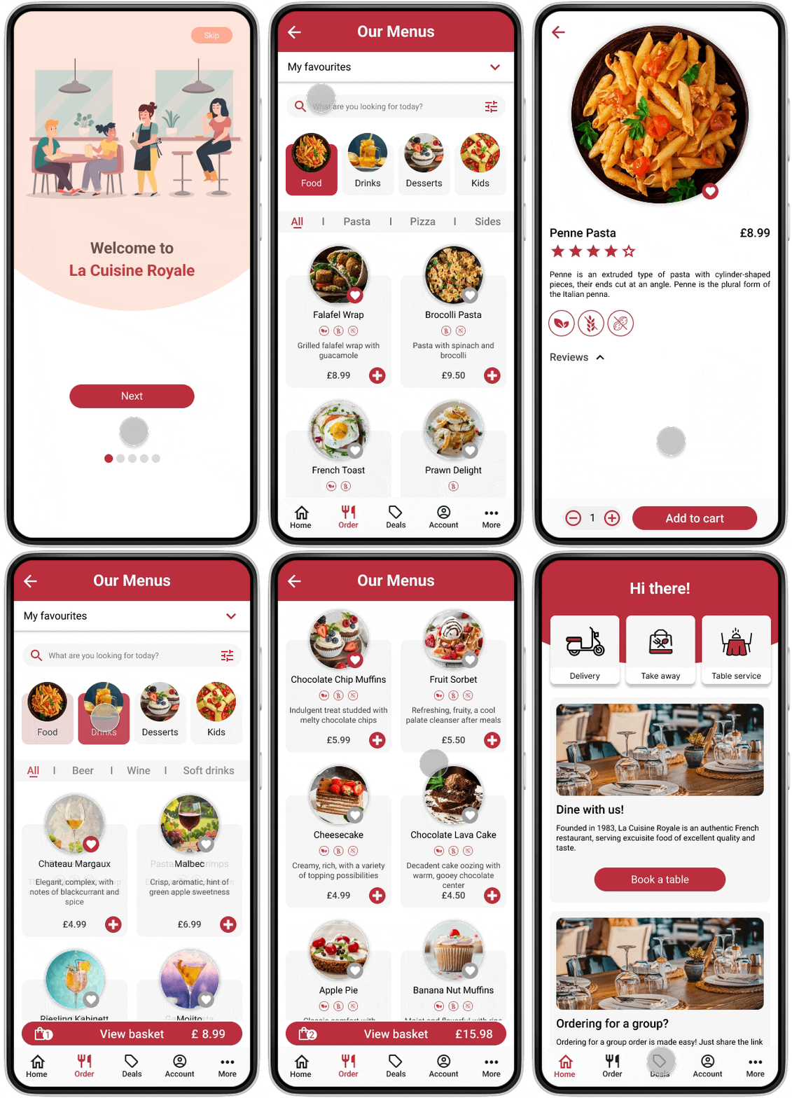
Designing of the restaurant app has been a journey focused on creating an exceptional user experience tailored to meet the needs and preferences of the target audience. Through extensive user research, including interviews, surveys, and quantitative analysis, I gained invaluable insights into user behaviors, pain points, and preferences. Leveraging these insights, I meticulously crafted intuitive features such as the ability to order food for delivery, collection, or serving at the table, as well as the convenient option to book a table seamlessly. By prioritizing simplicity, clarity, and efficiency in my design process, I aimed to streamline the user journey from start to finish.
By placing the needs of the users at the forefront of my design process, I have created a valuable tool that not only simplifies the process of ordering food and booking tables but also enhances the overall dining experience for the customers. As I continue to iterate and improve upon my app, I remain committed to delivering exceptional value and satisfaction to the users.
My design efforts have resulted in a significant improvement in key metrics.